Here is the finalized version of all of the things I created for the blade project:


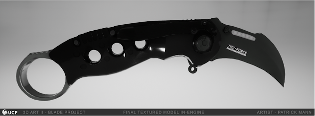

Here is the finalized version of all of the things I created for the blade project:
This sprint, I simply started working on the new versions of the proxy models. They didn't really have much to do with the "beginning, middle, end" theme of the week, but I just resolved to plug away at all the models I needed to do. This week, I created improved proxy models for all five of the lab assets - the capsule machine, the machine, the scale, the computer terminal, and the lab fence. The initial models are done, but I haven't seen to the UVs or textures yet. The capsule machine and computer terminal wound up a bit outside of the poly budget, and need to have lower-res versions created for a normal map in substance painter. Still, progress is progress, and here's what I got done:


Following up from the previous meeting, I gathered up a collection of artists from Artstation to use as reference for what I wanted to do - in general, environmental art, and, more specifically, stylized environmental art. Here are the results from my information gathering:
https://www.artstation.com/patrickmann/collections/1627650

Nigel Goh - https://www.artstation.com/nigelgoh
I really liked the rounded, bubbly shapes that Goh was using for his pieces. He has a really distinct, hyper-stylized aesthetic that I enjoyed, where the colors are super bright and everything in the scene almost looks like it's made out of balloons. Really seems like a good thing to reference for things further along the stylization scale.
Brent Critchfield - https://www.artstation.com/brentcritchfield
I really liked all of the detail that Critchfield put into his environments - there's a lot of really interesting stuff going on all over the place in the examples he's got up there. As someone who's thinking of doing environmental art for a career, that sort of thing seems like the high water mark for what I'm doing. Plus, the visual style is just neat, too - the way he does his models reminds me a lot of the Orb style, and the use of overarching colors in a scene is neat, too.
Josef Griffiths - https://www.artstation.com/josefgriffiths
On the opposite end of hyper-stylized stuff like Goh's work, I also grabbed inspiration from Griffiths' environmental work. The stylization in this stuff is very slight, and it overall more leans towards realism. I thought it would be best to have something like this for a frame of reference - something a little more grounded that I could use as a jumping off point for doing crazier stuff. In any case, I do like Griffiths' work on it's own - it's nice, solid, efficient environmental stuff, and he's doing neat things with lighting.
Tim Burroughs - https://www.artstation.com/tim_burroughs
I really liked how Burroughs created really clean-looking, cohesive environments. Everything about the assets he made are very crisp and tightly designed, making the most of what he had. The stuff on display is still highly detailed, but in a away that doesn't take away from the stylization, and really helps the environment to come together.
Bart de Vries - https://www.artstation.com/bartndv\
I think the work of de Vries might be some of my favorite of all of the art on display here. He has these really detailed, highly exaggerated environments on display that really do some fun things with stylization. There's really no straight lines on display, which I think really helps to make some interesting shapes in the environment.
Haibo Wu - https://www.artstation.com/bobeye
Wu's work was also something that drew my eye because it had a similarity to the Orb style. I enjoyed how well the art worked for how low-poly it was, effectively hiding the low poly count through detailed textures and modeling tricks. That is really something I aim for - being efficient with the poly count is a good way that I, as an artist, can help make sure the game runs smoothly, so I'm always interested in seeing ways I can do more with less.
Bodom - https://www.artstation.com/bodom_tss
Bodom was doing some really interesting stuff with how hyper-stylized the work on display was. The Might & Magic tributes are a key example of this - the colors are flat and exaggerated, and the shapes themselves are very simple and low res. And yet, the whole arrangement comes out looking fantastic in the end, which I think is neat. Bodom's work is on the pretty far end of stylized, which I feel like is a good reference to have at hand.
Marta Ribeiro - https://www.artstation.com/martaribeiro
Marta's art drew me in with some of the interesting indoors environments she made, particularly the "Melodramatica" one, which is stylized in a really neat way. She seems to have a talent for adapting her stylized art to a variety of different aesthetics, which I think is neat. Also, the "Overgrown Church" I added to my reference board is a really neat setup, with how modular is.
Loóna - https://www.artstation.com/loonaapp
The small, self-contained scenes made by the Loóna team were really appealing to me because, despite all of them being mostly man-made objects, they had some really interesting flowing shapes to them. It's a really neat exaggerated style that makes even solid objects look almost fluid and organic, which I think would be a pretty cool way to stylize a scene. Also, I really liked the use of bright, flat colors they had, too.
Pejman Aghei - https://www.artstation.com/pejman
The thing that drew me to Aghei's art was some of the interesting stonework and statuary he did - they really strike a good balance between keeping the simple stylized shapes preserved, while still having good surface detail, and it all reminded me quite a bit of Orb's style. That said, the piece of his I chose was the mushrooms, which I think was just my affinity for the shape of mushrooms. They're fun to model.
Moving onwards from the last check in, I've moved the knife project further. I created a game resolution mesh for the knife, gave it some UVs, and took it into Substance Painter to get a mesh bake from the high-resolution ZBrush sculpt from last week. Here's how all that turned out:


Rules for going into the next steps of the project:
Game-Res mesh should be no more than 12,000 polys, should be somewhere around 7,000 polys.
There should only be one material.
Textures should be no bigger than 4,096.
Go to Artstation and research how other professional artists display their weapon models.
When rendering the wireframe mesh, make sure that it is clean, easily readable, uses polys (not tris), and is rendered using Arnold in Maya (when in the render view, go to Render>Debug Shading>Wireframe).
Present images in the professional layout with your name and whatnot on the bottom.
Might also be a good idea to provide wireframes for the shapes used to cut out booleans.
Response to my knife model/notes for improvement:
Go back and fix the wireframe render on the proxy model.
Lighten up the Arnold Render of the proxy model so it's easier to see.
Fix the faceting on the pivot for the blade, to make it smoother.
Pull out a bit on the renders from ZBrush to give it more room. Layer out a few versions of the knife from various angles to see all parts of it. Use a more professional template in general to present the high res.
After working on the knife project, to the required specifications, over the week, this is what I eventually came up with:
Proxy Model:


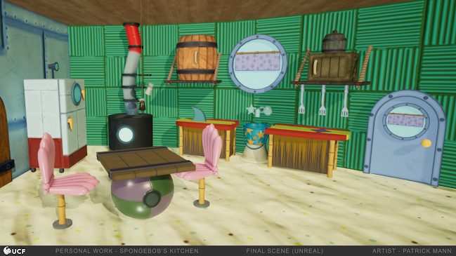
Okay, so, it really hasn't been a week. My Ventures project didn't need any more props or environment assets from me, so I wound u...